How to Match a Persian-Style Carpet With Your Furniture
Neutral, dark, wooden, modern or traditional - how to pair a patterned Persian-style carpet with the furniture you already own, without everything matching.
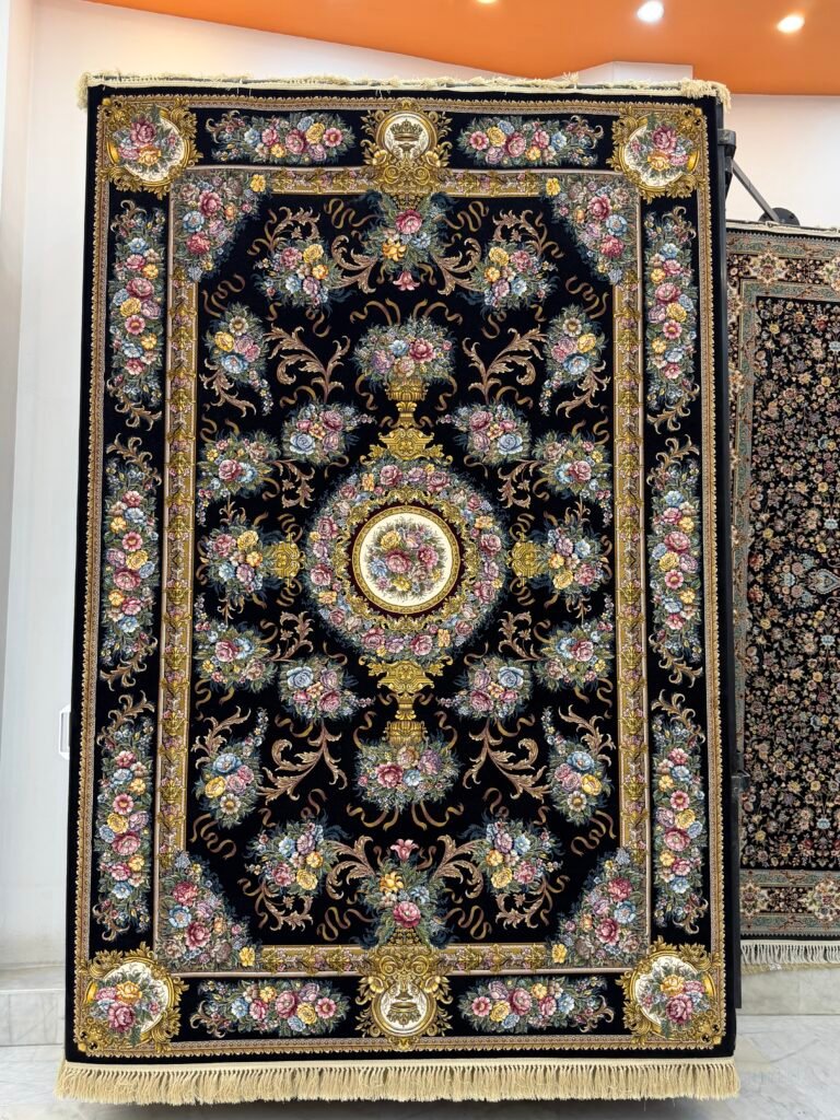
A Persian-style carpet brings several colours into a room at once, which is exactly why people worry about matching it to furniture they already own. The good news is that a multi-coloured carpet is far easier to work with than a plain one, because there is almost always something in it that agrees with what you have.
The method is simple: pull one or two colours out of the carpet, use those on the soft furnishings, and let everything else stay plain.
Start by naming three colours in the carpet
Look at the carpet and name the field colour, the dominant motif colour, and one accent that appears in small amounts – often in the border or in the centre of the flowers.
Those three become your palette for the room. Cushions, throws, curtains and lampshades should come from that list. Nothing else in the room needs to match the carpet at all.
Neutral furniture
Cream, beige, grey or off-white upholstery is the easiest case, and it is the reason so many people pair neutral sofas with patterned carpets.
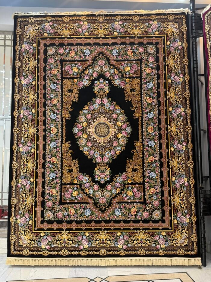
With neutral furniture, the carpet can be as strong as you like. A deep red or indigo field with a clear medallion will carry the room, and the sofa becomes a quiet frame around it. Pick two cushion colours from the carpet and the room is finished.
The one thing to watch: if the sofa is a warm cream and the carpet field is a cool grey, they can fight slightly. Put a cushion that contains both between them and the transition resolves.
Dark furniture
Charcoal, navy or black upholstery needs a carpet that provides contrast, or the whole lower half of the room becomes one dark mass.
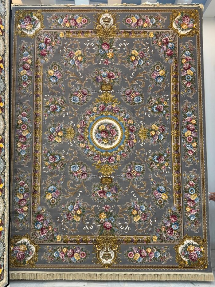
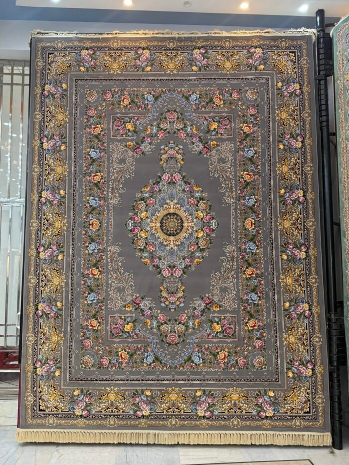
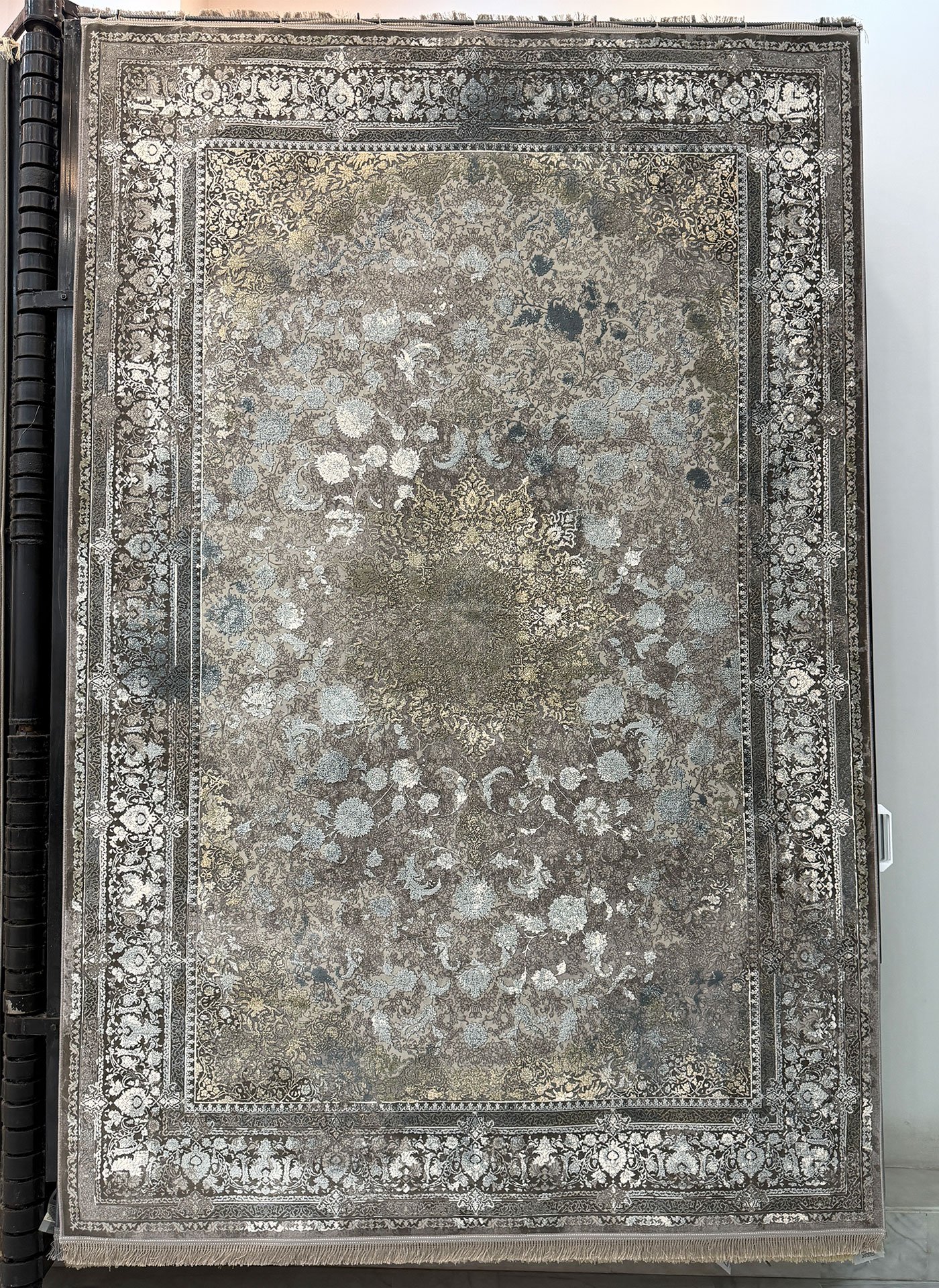
A cream, ivory or silver field is the reliable answer. It lifts the room and makes the dark furniture look deliberate rather than heavy. The Hareer collection, with its silk-finish silver and grey palettes, works particularly well here because the sheen catches light that a dark room otherwise loses.
If you want a dark carpet with dark furniture, it can be done, but the carpet needs a strong light-toned border to draw a line between the two.
Wooden furniture
Heavy carved wood – sheesham, walnut, dark rosewood – is common in Pakistani drawing rooms, and it is the case where carpet choice matters most.
The risk is that everything in the room lands in the same warm brown-and-red family and the furniture stops being visible against the floor. Two ways out:
- Cool the floor down. A grey, silver or sage field separates the furniture from the carpet and lets the woodwork read clearly. This is usually the better choice with a lot of wood.
- Go much darker or much lighter. If you want a warm carpet, choose one clearly darker or lighter than the wood rather than close to it. Close-but-not-matching is the only genuinely bad outcome.
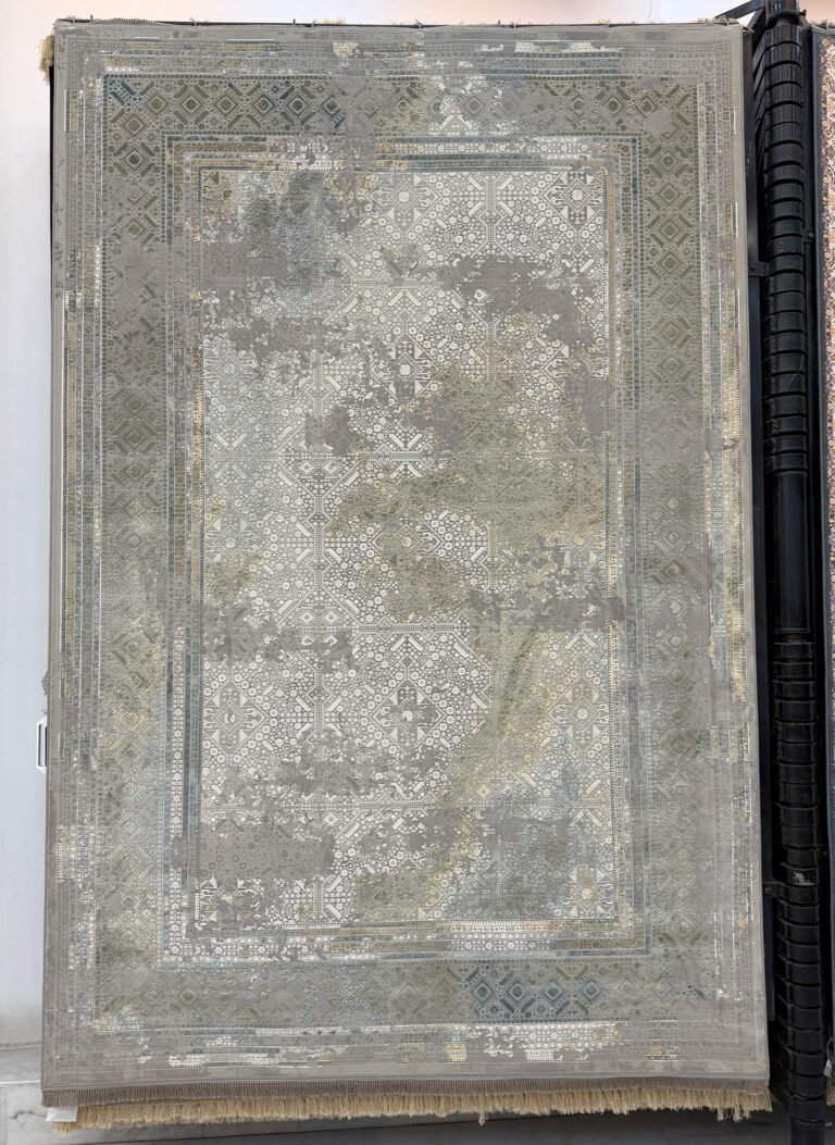
The Vintage collection is useful with wooden furniture, because the softened palettes sit beside wood without competing with it.
Modern interiors
Straight lines, plain upholstery, minimal ornament. A traditional carpet in a modern room is one of the most reliable combinations in interior design, because the contrast is the point – the carpet supplies all the warmth and detail the room is otherwise missing.
Two things make it work. Keep the rest of the room disciplined, so the carpet is unambiguously the feature. And choose a carpet with a reasonably calm palette rather than the busiest one you can find, so the contrast reads as considered rather than accidental.
Traditional interiors
In a room that already has carved furniture, patterned curtains and ornament on the walls, the carpet should usually be the calm element rather than another loud one.
Look for an open field with the pattern concentrated in the border, or an all-over design in tones close together. You still get a traditional carpet; it simply is not competing with the curtains.
Balancing pattern
A useful rule when you are unsure: in any one room, allow one thing to be busy. If the carpet is busy, the curtains and upholstery are plain. If the curtains are busy, the carpet is calm.
If you want two patterned elements, make them different in scale. A large-scale medallion carpet can live with a small-scale geometric cushion, because the eye reads them as different kinds of thing. Two patterns at the same scale read as a clash.
Coordinating, not matching
Matching is when everything is the same colour. Coordinating is when everything belongs to the same family. The second one looks considered; the first one looks like a showroom set.
So if the carpet has a deep red field, do not buy red curtains. Take a lighter or deeper tone from somewhere else in the carpet – the cream of a border, the gold of a palmette centre – and use that. The room will feel connected without anything being an exact match.
A quick test before you commit
Photograph the room, then hold a photograph of the carpet next to it on your phone. Convert both to black and white. If the carpet and the furniture come out at clearly different tones, the pairing will work. If they come out at the same tone, they will blur into each other in the real room regardless of the colours.
It takes a minute and it catches almost every mistake.
Where to start
If you already own the furniture, start from the carpet field colour and work outwards. If you are furnishing from scratch, buy the carpet first – it is the hardest element to find in exactly the right tone, and everything else has more options.
You can browse the full Kazmi collection by design and colour, or read our guide to traditional and modern carpet designs if you are still deciding which direction to take the room.